🏆 80 points available
🤠 Author: Park (ypark32@illinois
.edu) ✏️ Last updated on 3/20/2025

💎 Case Overview
Four Transportation Network Providers (TNPs), often called rideshare companies 🚗, have been licensed to operate in Chicago. These TNPs are required to routinely report information on vehicles, drivers, and trips to the City of Chicago, which is published on the Chicago Data Portal. The latest trips dataset can be downloaded from this page.
🐢 Your Dataset
The original dataset contains information about 170 million ridesharing trips between 2018 and 2021 translating to over 40GB of raw data. 🙀☠️🙀
Approximately 1% of the original data has been randomly sampled, preprocessed, and compressed.
Only 2019 and 2020 data have been selected.
⚔️ Your Goal
Analyze the dataset and answer the following questions:
👉 How has the COVID-19 affected the total number of trips in 2019 and 2020?
👉 How has the COVID-19 affected the number of monthly trips?
👉 Have passengers become more generous or frugal when tipping during the pandemic?
👉 What were the trip dimensions (trip duration, distance, and fare) of rides taken right before the July 4th fireworks in 2019 and 2020?
👉 Were passengers pooling rides during the pandemic?
👉 What are the top 20 pickup areas (by volume)?
👉 What is the average trip total for each of the top 20 pickup areas?
👉 Is there any area that has an unusually large trip total?
▶️ Run the code cell below to import unittest, a module used for 🧭 Check Your Work sections and the autograder.
# DO NOT MODIFY THE CODE IN THIS CELL
import base64
import unittest

tc = unittest.TestCase()
🔨 Import Packages and Dataset
▶️ Run the code cell below to import packages used in the case.
import pandas as pd
import numpy as np
import plotly
import plotly.express as px
import plotly.graph_objects as go

# plotly.io is a low-level interface for interacting with figures/
# plotly.io.templates lists available plotly templates
# https://plotly.com/python-api-reference/plotly.io.html
import plotly.io as pio

pd.set_option("display.max_columns", 50)
🧭 Check Plotly Version
Run the code below to ensure that your notebook uses the same Plotly version as the autograder.
# DO NOT CHANGE THE CODE IN THIS CELL
print(f"The current plotly version is {plotly.__version__}")
plotly_major_version = int(plotly.__version__.split(".")[0])

tc.assertGreaterEqual(
    plotly_major_version, 5, "Your plotly version should be greater than or equal to 5"
)
▶️ Run the code below to import and process the trips dataset.
df = pd.read_csv(
    "https://github.com/bdi475/datasets/raw/main/case-studies/chicago-ridesharing/chicago-ridesharing-trips-2019-2020.csv.gz",
    compression="gzip",
    parse_dates=["start"],
)
df_community_areas = pd.read_csv(
    "https://github.com/bdi475/datasets/raw/main/case-studies/chicago-ridesharing/chicago-community-area-numbers.csv"
)

# replace community area numbers with area names
df = df.merge(
    df_community_areas, left_on="pickup_area", right_on="area_number", how="left"
)
df["pickup_area"] = df["community"].copy()
df.drop(columns=["community", "area_number"], inplace=True)

df = df.merge(
    df_community_areas, left_on="dropoff_area", right_on="area_number", how="left"
)
df["dropoff_area"] = df["community"].copy()
df.drop(columns=["community", "area_number"], inplace=True)

# Create a copy for 🧭 Check Your Work section
df_backup = df.copy()
📐 Part 1: Data Overview
🎯 Deliverable 1: First 5 Rows
👇 Tasks
✔️ Display the first 5 rows of
dfusing.head().
🚀 Hint
my_dataframe.head()# YOUR CODE BEGINS
# YOUR CODE ENDS🧭 Check Your Work
Run the code cell below to test your solution.
✔️ If the code cell runs without errors, you’re good to move on.
❌ If the code cell produces an error, review your code and fix any mistakes.
_test_case = "deliverable-01"
_points = 2
# manually graded cell
pass🎯 Deliverable 2: Summary of DataFrame
👇 Tasks
✔️ Print a concise summary of
dfusing.info().
🚀 Hint
my_dataframe.info()# YOUR CODE BEGINS
# YOUR CODE ENDS🧭 Check Your Work
Run the code cell below to test your solution.
✔️ If the code cell runs without errors, you’re good to move on.
❌ If the code cell produces an error, review your code and fix any mistakes.
_test_case = "deliverable-02"
_points = 2
# manually graded cell
pass🎯 Deliverable 3: Number of Rows and Columns in the Dataset
👇 Tasks
✔️ Store the number of rows in
dfto a new variable namednum_rows.✔️ Store the number of columns in
dfto a new variable namednum_cols.
# YOUR CODE BEGINS

# YOUR CODE ENDS
print(f"There are {num_rows} rows and {num_cols} columns in the dataset.")🧭 Check Your Work
Run the code cell below to test your solution.
✔️ If the code cell runs without errors, you’re good to move on.
❌ If the code cell produces an error, review your code and fix any mistakes.
_test_case = "deliverable-03"
_points = 2
tc.assertEqual(
num_rows, len(df_backup.index), f"Number of rows should be {len(df_backup.index)}"
)
tc.assertEqual(
num_cols,
len(df_backup.columns),
f"Number of columns should be {len(df_backup.columns)}",
)🗓️ Part 2: Extract Datetime Values into Separate Columns
The start column contains trip start timestamps. In this part of the case study, you will extract year, month, day of the month, day of the week, hour, and weekday/weekend information into separate columns.
🎯 Deliverable 4: Extract Year into a New Column
▶️ Run the code below to print the first 3 values of the start column and the data types.
display(df["start"].head(3))
print("=================================================")
print(f"df['start'] column's data type is {df['start'].dtype}.")👇 Tasks
✔️ From
df, extract the year (e.g.,2019,2020) from thestartcolumn and store it in a new column namedyear.
🔑 Expected Output
| start | year | |
|---|---|---|
| 400000 | 2019-05-28 19:00:00 | 2019 |
| 600000 | 2019-08-12 19:15:00 | 2019 |
| 800000 | 2019-10-29 08:00:00 | 2019 |
| 1000000 | 2020-01-15 12:45:00 | 2020 |
| 1200000 | 2020-06-09 17:00:00 | 2020 |
# YOUR CODE BEGINS

# YOUR CODE ENDS
# display 5 rows at indices 400000, 600000, 800000, 1000000, 1200000
df_sample = df[df.index.isin([400000, 600000, 800000, 1000000, 1200000])]
display(df_sample[["start", "year"]])🧭 Check Your Work
Run the code cell below to test your solution.
✔️ If the code cell runs without errors, you’re good to move on.
❌ If the code cell produces an error, review your code and fix any mistakes.
_test_case = "deliverable-04"
_points = 2
_obfuscate = True

df_backup["year"] = df_backup["start"].dt.year

tc.assertEqual(df.shape, df_backup.shape, "Incorrect number of rows and/or columns")
pd.testing.assert_frame_equal(
    df[["start", "year"]].sort_values("start").reset_index(drop=True),
    df_backup[["start", "year"]].sort_values("start").reset_index(drop=True),
)
🎯 Deliverable 5: Extract Month, Day of Month, Day of Week, and Hour into Columns
👇 Tasks
✔️ Similar to the previous deliverable, extract the month, day of month, day of week, and hour of each start time in
dfto new columns.✔️ Use the following column names. Sample values are also given.
month:1,2, ...,11,12day:1,2, ...,28,29,30,31dayofweek:0for Monday,6for Sundayhour:0,1, ...,22,23
🔑 Expected Output
| start | month | day | dayofweek | hour | |
|---|---|---|---|---|---|
| 400000 | 2019-05-28 19:00:00 | 5 | 28 | 1 | 19 |
| 600000 | 2019-08-12 19:15:00 | 8 | 12 | 0 | 19 |
| 800000 | 2019-10-29 08:00:00 | 10 | 29 | 1 | 8 |
| 1000000 | 2020-01-15 12:45:00 | 1 | 15 | 2 | 12 |
| 1200000 | 2020-06-09 17:00:00 | 6 | 9 | 1 | 17 |
# YOUR CODE BEGINS

# YOUR CODE ENDS

# display 5 rows at indices 400000, 600000, 800000, 1000000, 1200000
df_sample = df[df.index.isin([400000, 600000, 800000, 1000000, 1200000])]
display(df_sample[["start", "month", "day", "dayofweek", "hour"]])
🧭 Check Your Work
Run the code cell below to test your solution.
✔️ If the code cell runs without errors, you’re good to move on.
❌ If the code cell produces an error, review your code and fix any mistakes.
_test_case = "deliverable-05"
_points = 4

decoded_code = base64.b64decode(
    b"ZGZfYmFja3VwWydtb250aCddID0gZGZfYmFja3VwWydzd\
GFydCddLmR0Lm1vbnRoCmRmX2JhY2t1cFsnZGF5J10gPSBkZl9iYWNrdXBbJ3N0YXJ0J10uZHQuZG\
F5CmRmX2JhY2t1cFsnZGF5b2Z3ZWVrJ10gPSBkZl9iYWNrdXBbJ3N0YXJ0J10uZHQuZGF5b2Z3ZWV\
rCmRmX2JhY2t1cFsnaG91ciddID0gZGZfYmFja3VwWydzdGFydCddLmR0LmhvdXI="
)
eval(compile(decoded_code, "<string>", "exec"))

tc.assertEqual(df.shape, df_backup.shape, "Incorrect number of rows and/or columns")
pd.testing.assert_frame_equal(
    df[["start", "month", "day", "dayofweek", "hour"]]
    .sort_values("start")
    .reset_index(drop=True),
    df_backup[["start", "month", "day", "dayofweek", "hour"]]
    .sort_values("start")
    .reset_index(drop=True),
)
🎯 Deliverable 6: Create weekday_weekend Column
👇 Tasks
✔️ Assume Mondays-Thursdays are weekdays and Fridays-Sundays are weekends.
✔️ Create a new column named
weekday_weekendindf.✔️ For each row, the value of
weekday_weekendwill either be string'weekday'or string'weekend'(case-sensitive) based on the value of thedayofweekcolumn.'weekday'ifdayofweekis less than or equal to3(0== Monday,1== Tuesday,2== Wednesday,3== Thursday)'weekend'if otherwise (4== Friday,5== Saturday,6== Sunday)
🚀 Hint
There are many ways to achieve this task.
The code below creates a new column named cheap_expensive where the value will be string 'cheap' if the price is less than or equal to 10 and 'expensive' if otherwise.
my_dataframe['cheap_expensive'] = np.where(my_dataframe['price'] <= 10, 'cheap', 'expensive')# YOUR CODE BEGINS
# YOUR CODE ENDS
display(df[["dayofweek", "weekday_weekend"]].sample(5))🧭 Check Your Work
Run the code cell below to test your solution.
✔️ If the code cell runs without errors, you’re good to move on.
❌ If the code cell produces an error, review your code and fix any mistakes.
_test_case = "deliverable-06"
_points = 3

decoded_code = base64.b64decode(
    b"ZGZfYmFja3VwWyd3ZWVrZGF5X3dlZWtlbmQnXSA9IG5wL\
ndoZXJlKGRmX2JhY2t1cFsnZGF5b2Z3ZWVrJ10gPD0gMywgJ3dlZWtkYXknLCAnd2Vla2VuZCcp"
)
eval(compile(decoded_code, "<string>", "exec"))

tc.assertEqual(df.shape, df_backup.shape, "Incorrect number of rows and/or columns")
pd.testing.assert_frame_equal(
    df[["start", "dayofweek", "weekday_weekend"]]
    .sort_values("start")
    .reset_index(drop=True),
    df_backup[["start", "dayofweek", "weekday_weekend"]]
    .sort_values("start")
    .reset_index(drop=True),
)
😷 Part 3: Visualize the Effects of COVID-19 on the Volume of Ridesharing Trips
Although the first case of COVID-19 was reported in January 2020 in the United States, people started to take it seriously in March 2020.
How did COVID-19 affect the volume of ridesharing trips? 💨 Let’s visualize and compare the monthly number of trips for both 2019 and 2020.
🎯 Deliverable 7: Total Number of Trips in 2019 and 2020
👇 Tasks
✔️ Using
df, count the number of trips made in 2019 and store the number in a new variable namednum_2019_trips.✔️ Using
df, count the number of trips made in 2020 and store the number in a new variable namednum_2020_trips.
🚀 Hint
For num_2019_trips, retrieve the number of rows where df['year'] is 2019.
# YOUR CODE BEGINS

# YOUR CODE ENDS

print(f"There were {num_2019_trips} trips in 2019.")
print(f"There were {num_2020_trips} trips in 2020.")
print(
    f"The number of trips decreased by {(num_2019_trips - num_2020_trips) / num_2019_trips * 100:.1f}%."
)
🧭 Check Your Work
Run the code cell below to test your solution.
✔️ If the code cell runs without errors, you’re good to move on.
❌ If the code cell produces an error, review your code and fix any mistakes.
_test_case = "deliverable-07"
_points = 3

decoded_code = base64.b64decode(
    b"bnVtXzIwMTlfdHJpcHNfY2hlY2sgPSBkZ\
l9iYWNrdXBbJ3llYXInXS52YWx1ZV9jb3VudHMoKS5sb2NbMjAxOV0KbnVtXzIwMjBf\
dHJpcHNfY2hlY2sgPSBkZl9iYWNrdXBbJ3llYXInXS52YWx1ZV9jb3VudHMoKS5sb2NbMjAyMF0="
)
eval(compile(decoded_code, "<string>", "exec"))

tc.assertEqual(
    num_2019_trips,
    num_2019_trips_check,
    f"Incorrect number of 2019 trips, should be {num_2019_trips_check}",
)
tc.assertEqual(
    num_2020_trips,
    num_2020_trips_check,
    f"Incorrect number of 2020 trips, should be {num_2020_trips_check}",
)
🎯 Deliverable 8: Monthly Number of Trips and Tip Percentage
👇 Tasks
✔️ Using
df, calculate the number of monthly trips and average tip percentages.✔️ Use the code given below.
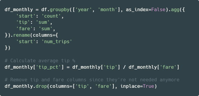
# YOUR CODE BEGINS

# YOUR CODE ENDS

display(df_monthly.head(5))
🧭 Check Your Work
Run the code cell below to test your solution.
✔️ If the code cell runs without errors, you’re good to move on.
❌ If the code cell produces an error, review your code and fix any mistakes.
_test_case = "deliverable-08"
_points = 2
_obfuscate = True
df_monthly_check = (
df_backup.groupby(["year", "month"], as_index=False)
.agg(
{
"start": "count",
"tip": "sum",
"fare": "sum",
}
)
.rename(columns={"start": "num_trips"})
)
df_monthly_check["tip_pct"] = df_monthly_check["tip"] / df_monthly_check["fare"]
df_monthly_check.drop(columns=["tip", "fare"], inplace=True)
tc.assertEqual(
df_monthly.shape, df_monthly_check.shape, "Incorrect number of rows and/or columns"
)
pd.testing.assert_frame_equal(
df_monthly.sort_values(["year", "month"]).reset_index(drop=True),
df_monthly_check.sort_values(["year", "month"]).reset_index(drop=True),
check_like=True,
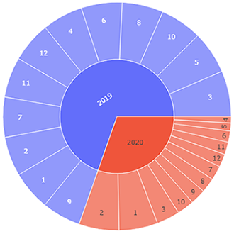
)🎯 Deliverable 9: Sunburst Chart of Monthly Trips
👇 Tasks
✔️ Using
df_monthly, create a sunburst chart that shows the proportion of monthly number of trips for both 2019 and 2020.✔️ Set an appropriate title.
✔️ Set both the
widthandheightto600.✔️ Store your figure in a variable named
fig.✔️ Display the figure using
fig.show()
🔑 Sample Output
🚀 Hint
Replace my_dataframe, 'column1', 'column2', 'column3', and ...s with your own values from the code below.
fig = px.sunburst(
    my_dataframe,
    path=['column1', 'column2'],
    values='column3',
    title='Your Title Here',
    width=...,
    height=...
)
fig.show()
# YOUR CODE BEGINS
# YOUR CODE ENDS🧭 Check Your Work
Run the code cell below to test your solution.
✔️ If the code cell runs without errors, you’re good to move on.
❌ If the code cell produces an error, review your code and fix any mistakes.
_test_case = "deliverable-09"
_points = 4
_obfuscate = True
tc.assertIsNotNone(fig.layout.title.text, "Missing figure title")
tc.assertEqual(fig.data[0].type, "sunburst", "Must be a sunburst chart")
tc.assertEqual(fig.layout.width, 600, "Incorrect width")
tc.assertEqual(fig.layout.height, 600, "Incorrect height")
fig_check = px.sunburst(
df_monthly_check,
path=["year", "month"],
values="num_trips",
title="Trips Breakdown by Year and Month",
width=600,
height=600,
)
np.testing.assert_array_equal(
fig.data[0].labels, fig_check.data[0].labels, "Label(s) mismatch"
)
np.testing.assert_array_equal(
fig.data[0].parents, fig_check.data[0].parents, "Parent(s) mismatch"
)
np.testing.assert_array_equal(
fig.data[0].values, fig_check.data[0].values, "Value(s) mismatch"
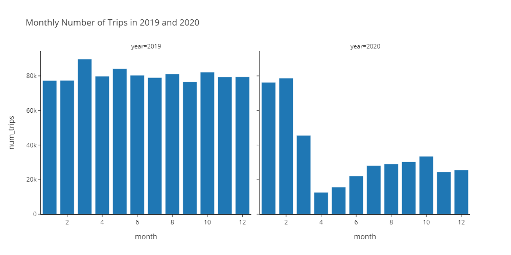
)🎯 Deliverable 10: Monthly Number of Trips in 2019 and 2020 (Facet Grid Bar Chart)
👇 Tasks
✔️ Using
df_monthly, create two bar charts side-by-side within the same figure, showing the number of monthly trips for 2019 and 2020.You will have to use a facet grid that we haven’t covered in lectures.
A facet grid is a group of plots within one figure categorized by 1 or 2 criteria.
This deliverable expects you to do some research on your own, although the hint will provide the majority of the code required to complete this task.
✔️ Set an appropriate title.
✔️ Use the
'simple_white'theme (template).✔️ Set the
widthto1000andheightto500.✔️ Store your figure in a variable named
fig.✔️ Display the figure using
fig.show()
🔑 Sample Output
🚀 Hint
Replace my_dataframe, 'column1', 'column2', 'column3', and ...s with your own values from the code below.
fig = px.bar(
my_dataframe,
title='Your Title Here',
x='column1',
y='column2',
facet_col='column3',
width=...,
height=...,
template='simple_white',
)
fig.show()# YOUR CODE BEGINS
# YOUR CODE ENDS🧭 Check Your Work
Run the code cell below to test your solution.
✔️ If the code cell runs without errors, you’re good to move on.
❌ If the code cell produces an error, review your code and fix any mistakes.
_test_case = "deliverable-10"
_points = 4
tc.assertIsNotNone(fig.layout.title.text, "Missing figure title")
tc.assertEqual(
len(fig.data), 2, "Must use a facet grid to display two bar charts side-by-side"
)
tc.assertEqual(fig.layout.width, 1000, "Incorrect width")
tc.assertEqual(fig.layout.height, 500, "Incorrect height")
tc.assertEqual(
fig.layout.template, pio.templates["simple_white"], "Incorrect plotly template"
)
decoded_code = base64.b64decode(
b"ZmlnX2NoZWNrID0gcHguYmFyKAogICAgZGZfbW9udGhseV9jaGV\
jaywKICAgIHRpdGxlPSdNb250aGx5IE51bWJlciBvZiBUcmlwcyBpbiAyMDE5IGFuZCAyMDIwJywKICAgIHg9\
J21vbnRoJywKICAgIHk9J251bV90cmlwcycsCiAgICBmYWNldF9jb2w9J3llYXInLAogICAgd2lkdGg9MTAwM\
CwKICAgIGhlaWdodD01MDAsCiAgICB0ZW1wbGF0ZT0ncGxvdGx5X2RhcmsnLAogICAgY29sb3I9J251bV90cm\
lwcycsCiAgICBjb2xvcl9jb250aW51b3VzX3NjYWxlPVsnV2hpdGUnLCAnWWVsbG93J10KKQ=="
)
eval(compile(decoded_code, "<string>", "exec"))
for i in range(len(fig_check.data)):
tc.assertEqual(fig.data[i].type, "bar", "Must be a bar chart")
tc.assertEqual(fig.data[i].orientation, "v", "Must be a vertical bar chart")
np.testing.assert_array_equal(
fig.data[i].x, fig_check.data[i].x, "x-axis value(s) mismatch"
)
np.testing.assert_array_equal(
fig.data[i].y, fig_check.data[i].y, "y-axis value(s) mismatch"
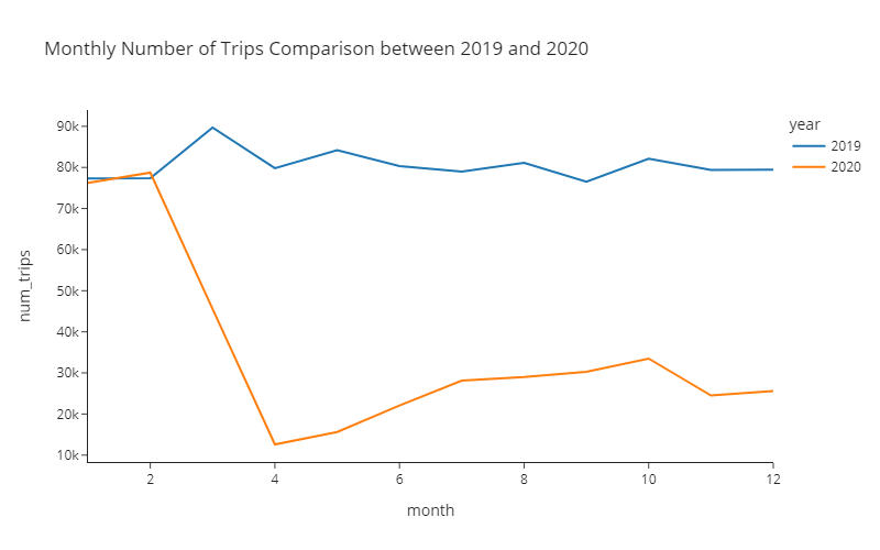
)🎯 Deliverable 11: Monthly Number of Trips in 2019 and 2020 (Line Plot)
👇 Tasks
✔️ Using
df_monthly, create a line plot of the monthly number of trips.Use
yearto create two separate lines (encoded by different colors) for 2019 and 2020.
✔️ Set an appropriate title.
✔️ Use the
'simple_white'theme (template).✔️ Set the
widthto800andheightto500.✔️ Store your figure in a variable named
fig.✔️ Display the figure using
fig.show()
🔑 Sample Output
🚀 Hint
Replace my_dataframe, 'column1', 'column2', 'column3', and ...s with your own values from the code below.
fig = px.line(
my_dataframe,
title='Your Title Here',
x='column1',
y='column2',
color='column3',
template='simple_white',
width=...,
height=...
)
fig.show()# YOUR CODE BEGINS
# YOUR CODE ENDS🧭 Check Your Work
Run the code cell below to test your solution.
✔️ If the code cell runs without errors, you’re good to move on.
❌ If the code cell produces an error, review your code and fix any mistakes.
_test_case = "deliverable-11"
_points = 4
tc.assertIsNotNone(fig.layout.title.text, "Missing figure title")
tc.assertEqual(
len(fig.data),
df_monthly_check["year"].nunique(),
"Must encode each year with different colors",
)
tc.assertEqual(fig.layout.width, 800, "Incorrect width")
tc.assertEqual(fig.layout.height, 500, "Incorrect height")
tc.assertEqual(
fig.layout.template,
pio.templates["simple_white"],
"Incorrect plotly theme (template)",
)
decoded_code = base64.b64decode(
b"ZmlnX2NoZWNrID0gcHgubGluZSgKICAgIG\
RmX21vbnRobHlfY2hlY2ssCiAgICB0aXRsZT0nTW9udGhseSBOdW1iZXIgb2YgVHJpcH\
MgQ29tcGFyaXNvbiBiZXR3ZWVuIDIwMTkgYW5kIDIwMjAnLAogICAgeD0nbW9udGgnLA\
ogICAgeT0nbnVtX3RyaXBzJywKICAgIGNvbG9yPSd5ZWFyJywKICAgIHRlbXBsYXRlPS\
dwbG90bHlfZGFyaycsCiAgICB3aWR0aD04MDAsCiAgICBoZWlnaHQ9NTAwCik="
)
eval(compile(decoded_code, "<string>", "exec"))
for i in range(len(fig_check.data)):
# In plotly, a line plot is a scatter plot with lines connecting the dots
tc.assertEqual(fig.data[i].type, "scatter", "Must be a line plot")
tc.assertIsNotNone(fig_check.data[i].line.color, "Must be a line plot")
np.testing.assert_array_equal(
fig.data[i].x, fig_check.data[i].x, "x-axis value(s) mismatch"
)
np.testing.assert_array_equal(
fig.data[i].y, fig_check.data[i].y, "y-axis value(s) mismatch"
)📌 Interpreting the Pre-COVID vs. Post-COVID Monthly Number of Trips
🔍 In March 2020, the number of trips plummeted due to the widespread outbreak of COVID-19.
🔍 April 2020 was the worst month for ridesharing drivers.
🔍 The number of trips slowly increased from April to October.
🔍 In November 2020, a continued surge in the number of COVID-19 cases has caused the number of trips to go down again.
💵 Part 4: Visualize the Effect of COVID-19 on Tips
Did passengers tip more on average during the pandemic since they appreciated the drivers providing services during risky times?
Or did the passengers tip less on average after the pandemic devastated the nation’s economy in 2020?
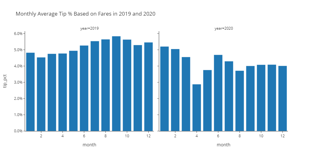
🎯 Deliverable 12: Monthly Average Tip Percentages in 2019 and 2020 (Facet Grid Bar Chart)
👇 Tasks
✔️ Using
df_monthly, create two bar charts side-by-side within the same figure, showing the monthly average tip percentages in 2019 and 2020.tip_pctcolumn indf_monthlycontains the monthly average tip percentages.
✔️ Set an appropriate title.
✔️ Use the
'simple_white'theme (template).✔️ Set the
widthto1000andheightto500.✔️ Store your figure in a variable named
fig.✔️ Display the figure using
fig.show()
🔑 Sample Output
🚀 Hint
Replace my_dataframe, 'column1', 'column2', 'column3', and ...s with your own values from the code below.
fig = px.bar(
my_dataframe,
title='Your Title Here',
x='column1',
y='column2',
facet_col='column3',
width=...,
height=...,
template='simple_white',
)
fig.update_layout(yaxis_tickformat=',.1%')
fig.update_layout(yaxis2_tickformat=',.1%')
fig.show()# YOUR CODE BEGINS
# YOUR CODE ENDS🧭 Check Your Work
Run the code cell below to test your solution.
✔️ If the code cell runs without errors, you’re good to move on.
❌ If the code cell produces an error, review your code and fix any mistakes.
_test_case = "deliverable-12"
_points = 4
_obfuscate = True
tc.assertIsNotNone(fig.layout.title.text, "Missing figure title")
tc.assertEqual(
len(fig.data), 2, "Must use a facet grid to display two bar charts side-by-side"
)
tc.assertEqual(fig.layout.width, 1000, "Incorrect width")
tc.assertEqual(fig.layout.height, 500, "Incorrect height")
tc.assertEqual(
fig.layout.template,
pio.templates["simple_white"],
"Incorrect plotly theme (template)",
)
fig_check = px.bar(
df_monthly_check,
title="Monthly Average Tip % Based on Fares in 2019 and 2020",
x="month",
y="tip_pct",
facet_col="year",
width=1000,
height=500,
template="plotly_dark",
color="tip_pct",
color_continuous_scale=["White", "GreenYellow"],
)
for i in range(len(fig_check.data)):
tc.assertEqual(fig.data[i].type, "bar", "Must be a bar chart")
tc.assertEqual(fig.data[i].orientation, "v", "Must be a vertical bar chart")
np.testing.assert_array_equal(
fig.data[i].x, fig_check.data[i].x, "x-axis value(s) mismatch"
)
np.testing.assert_array_equal(
fig.data[i].y, fig_check.data[i].y, "y-axis value(s) mismatch"
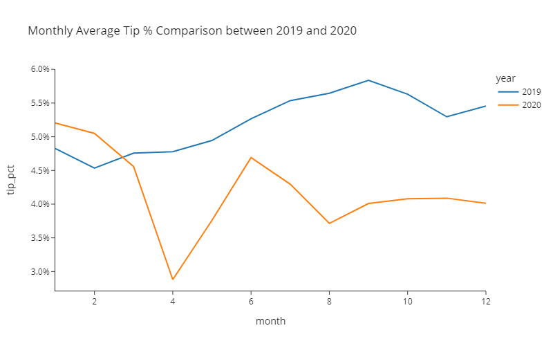
)🎯 Deliverable 13: Monthly Average Tip Percentages in 2019 and 2020
👇 Tasks
✔️ Using
df_monthly, create a line plot of monthly average tip percentages.Use
yearto create two separate lines (encoded by different colors) for 2019 and 2020.tip_pctcolumn indf_monthlycontains the monthly average tip percentages.
✔️ Set an appropriate title.
✔️ Use the
'simple_white'theme (template).✔️ Set the
widthto800andheightto500.✔️ Store your figure in a variable named
fig.✔️ Display the figure using
fig.show()
🔑 Sample Output
🚀 Hint
Replace my_dataframe, 'column1', 'column2', 'column3', and ...s with your own values from the code below.
fig = px.line(
my_dataframe,
title='Your Title Here',
x='column1',
y='column2',
color='column3',
template='simple_white',
width=...,
height=...
)
fig.update_layout(yaxis_tickformat=',.1%')
fig.show()# YOUR CODE BEGINS
# YOUR CODE ENDS🧭 Check Your Work
Run the code cell below to test your solution.
✔️ If the code cell runs without errors, you’re good to move on.
❌ If the code cell produces an error, review your code and fix any mistakes.
_test_case = "deliverable-13"
_points = 4
_obfuscate = True
tc.assertIsNotNone(fig.layout.title.text, "Missing figure title")
tc.assertEqual(
len(fig.data),
df_monthly_check["year"].nunique(),
"Must encode each year with different colors",
)
tc.assertEqual(fig.layout.width, 800, "Incorrect width")
tc.assertEqual(fig.layout.height, 500, "Incorrect height")
tc.assertEqual(
fig.layout.template,
pio.templates["simple_white"],
"Incorrect plotly theme (template)",
)
fig_check = px.line(
df_monthly_check,
title="Monthly Average Tip % Comparison between 2019 and 2020",
x="month",
y="tip_pct",
color="year",
template="plotly_dark",
width=800,
height=500,
)
for i in range(len(fig_check.data)):
# In plotly, a line plot is a scatter plot with lines connecting the dots
tc.assertEqual(fig.data[i].type, "scatter", "Must be a line plot")
tc.assertIsNotNone(fig_check.data[i].line.color, "Must be a line plot")
np.testing.assert_array_equal(
fig.data[i].x, fig_check.data[i].x, "x-axis value(s) mismatch"
)
np.testing.assert_array_equal(
fig.data[i].y, fig_check.data[i].y, "y-axis value(s) mismatch"
)📌 Interpreting the Pre-COVID vs. Post-COVID Average Percentage of Tips
🔍 Passengers tipped less after the COVID-19 outbreak.
🔍 Possible explanations:
COVID-19 has caused an economic downturn.
Many people have also lost jobs during this period.
COVID-19 may have prevented the driver and the passenger(s) from having a conversation. Less conversation could result in less tips.
✨ Part 5: Trips Right Before July 4th Fireworks
Every July 4th, massive crowds gather around places (or boats) to view the fireworks. How did July 4th become the “national fireworks day”? July 4, 1776 is considered to be the birth of the United States of America as an independent nation. The Continental Congress approved the final wording of the Declaration of Independence on July 4, 1776. The first-ever recorded July 4th fireworks celebration was held in Philadelphia on July 4, 1777. Since then, there hasn’t been an Independence Day without a firework. 💥💥
In this part, you will find trips started on July 4th between 5-6 PM and create different scatter plots based on those trips.
🎯 Deliverable 14: Filter July 4th 5-6 PM Trips
👇 Tasks
✔️ Using
df, filter rows where:monthis7(July) and,dayis4(4th) and,houris17(All trips starting between 5-6 pm)
✔️ Store the filtered DataFrame in a new variable named
df_july_fourth.✔️
dfshould remain unaltered after running your code.
🚀 Hint
The code below filters rows where column is 10, column2 is 20, and column3 is 30. The filtered DataFrame is stored in a new variable named my_filtered.
my_filtered_df = my_df[(my_df['column1'] == 10) & (my_df['column2'] == 20) & (my_df['column3'] == 30)]# YOUR CODE BEGINS
# YOUR CODE ENDS
display(df_july_fourth.sample(3))🧭 Check Your Work
Run the code cell below to test your solution.
✔️ If the code cell runs without errors, you’re good to move on.
❌ If the code cell produces an error, review your code and fix any mistakes.
_test_case = "deliverable-14"
_points = 3
decoded_code = base64.b64decode(
b"ZGZfanVseV9mb3VydGhfY2hlY2sgPSBkZl9iYWNrdXBbKGRmX2JhY2t1cFs\
nbW9udGgnXSA9PSA3KSAmIChkZl9iYWNrdXBbJ2RheSddID09IDQpICYgKGRmX2JhY2t1cFsnaG91ciddID09IDE3KV0="
)
eval(compile(decoded_code, "<string>", "exec"))
tc.assertEqual(
df_july_fourth.shape,
df_july_fourth_check.shape,
"Incorrect number of rows and/or columns",
)
pd.testing.assert_frame_equal(
df_july_fourth.sort_values(df_july_fourth.columns.tolist()).reset_index(drop=True),
df_july_fourth_check.sort_values(df_july_fourth_check.columns.tolist()).reset_index(
drop=True
),
check_like=True,
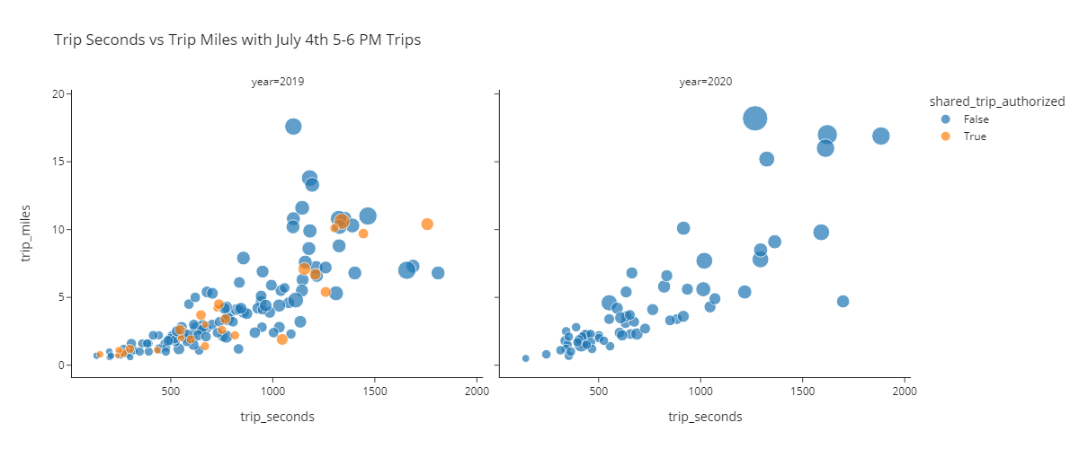
)🎯 Deliverable 15: July 4th 5-6 PM Trips Scatter Plots
👇 Tasks
✔️ Using
df_july_fourth, create two scatter plots for each year side-by-side within the same figure with the following axes.x:trip_seconds,y:trip_miles,
✔️ Use the
trip_totalcolumn to differentiate the sizes of points.✔️ Use the
shared_trip_authorizedcolumn to differentiate the colors of points.✔️ Set an appropriate title.
✔️ Use the
'simple_white'theme (template).✔️ Set the
widthto1200andheightto500.✔️ Store your figure in a variable named
fig.✔️ Display the figure using
fig.show()
🔑 Sample Output
🚀 Hint
Replace my_dataframe, 'column1', 'column2', 'column3', 'column4', 'column5', and ...s with your own values from the code below.
fig = px.scatter(
my_dataframe,
title='Your Title Here',
x='column1',
y='column2',
size='column3',
facet_col='column4',
color='column5',
template='simple_white',
width=...,
height=...,
)
fig.show()# YOUR CODE BEGINS
# YOUR CODE ENDS🧭 Check Your Work
Run the code cell below to test your solution.
✔️ If the code cell runs without errors, you’re good to move on.
❌ If the code cell produces an error, review your code and fix any mistakes.
_test_case = "deliverable-15"
_points = 3
# DO NOT CHANGE THE CODE IN THIS CELL
fig_check = px.scatter(
df_july_fourth_check,
title="Trip Seconds vs Trip Miles with July 4th 5-6 PM Trips",
x="trip_seconds",
y="trip_miles",
size="trip_total",
facet_col="year",
color="shared_trip_authorized",
template="plotly_dark",
width=1200,
height=500,
)
tc.assertIsNotNone(fig.layout.title.text, "Missing figure title")
tc.assertEqual(
len(fig.data),
len(fig_check.data),
"Must use a facet grid to display two scatter plots side-by-side with color-encoding",
)
tc.assertEqual(fig.layout.width, 1200, "Incorrect width")
tc.assertEqual(fig.layout.height, 500, "Incorrect height")
tc.assertEqual(
fig.layout.template,
pio.templates["simple_white"],
"Incorrect plotly theme (template)",
)
for i in range(len(fig_check.data)):
tc.assertEqual(fig.data[i].type, "scatter", "Must be a scatter plot")
np.testing.assert_array_equal(
fig.data[i].x, fig_check.data[i].x, "x-axis value(s) mismatch"
)
np.testing.assert_array_equal(
fig.data[i].y, fig_check.data[i].y, "y-axis value(s) mismatch"
)📌 Interpreting the Pre-COVID vs. Post-COVID Scatter Plots
🔍 There is a positive linear relationship between
trip_secondsandtrip_miles.🔍 The number of trips made on July 4th has decreased significantly in 2020 due to COVID-19.
🔍 There are no pooled trips (
shared_trips_authorized == True) in 2020.Why? Uber and Lyft both suspended pooled rides to limit the spread of coronavirus (Reuters article here) beginning in March 2020.
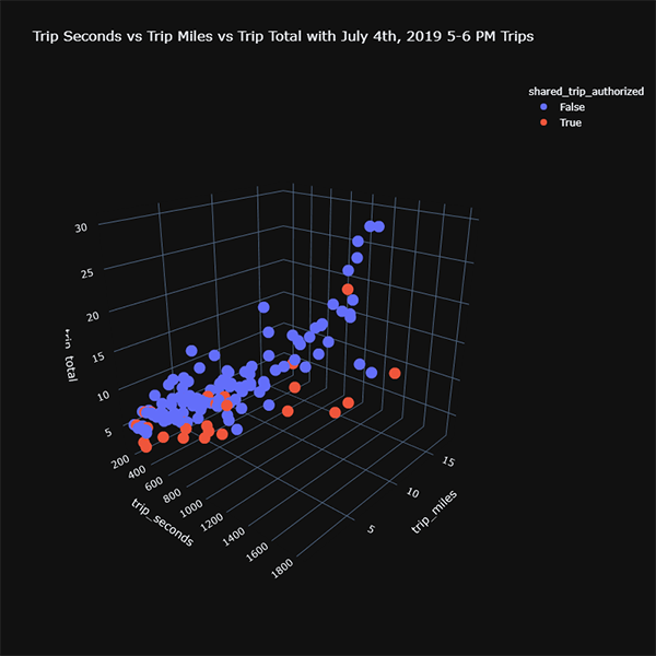
🎯 Deliverable 16: July 4th 5-6 PM Trips 3D Scatter Plots (Pre-COVID)
👇 Tasks
✔️ Using
df_july_fourth, create a 3D scatter plot of trips in 2019 using the following axes.x:trip_seconds,y:trip_miles,z:trip_total
✔️ Use the
shared_trip_authorizedcolumn to differentiate the colors of points.✔️ Set an appropriate title.
✔️ Use the
'plotly_dark'theme (template).✔️ Set both the
widthandheightto800.✔️ Store your figure in a variable named
fig.✔️ Display the figure using
fig.show()
🔑 Sample Output
🚀 Hint
Replace 'column1', 'column2', 'column3', 'column4', and ...s with your own values from the code below.
fig = px.scatter_3d(
df_july_fourth[df_july_fourth['year'] == 2019],
title='Your Title Here',
x='column1',
y='column2',
z='column3',
color='column4',
template='plotly_dark',
width=...,
height=...
)
fig.show()# YOUR CODE BEGINS
# YOUR CODE ENDS🧭 Check Your Work
Run the code cell below to test your solution.
✔️ If the code cell runs without errors, you’re good to move on.
❌ If the code cell produces an error, review your code and fix any mistakes.
_test_case = "deliverable-16"
_points = 3
decoded_code = base64.b64decode(
b"ZmlnX2NoZWNrID0gcHguc2NhdHRl\
cl8zZCgKICAgIGRmX2p1bHlfZm91cnRoX2NoZWNrW2RmX2p1bHlfZm91cnRoX2\
NoZWNrWyd5ZWFyJ10gPT0gMjAxOV0sCiAgICB0aXRsZT0nVHJpcCBTZWNvbmRz\
IHZzIFRyaXAgTWlsZXMgdnMgVHJpcCBUb3RhbCB3aXRoIEp1bHkgNHRoLCAyMD\
E5IDUtNiBQTSBUcmlwcycsCiAgICB4PSd0cmlwX3NlY29uZHMnLAogICAgeT0n\
dHJpcF9taWxlcycsCiAgICB6PSd0cmlwX3RvdGFsJywKICAgIGNvbG9yPSdzaG\
FyZWRfdHJpcF9hdXRob3JpemVkJywKICAgIHRlbXBsYXRlPSdwbG90bHlfZGFy\
aycsCiAgICB3aWR0aD04MDAsCiAgICBoZWlnaHQ9ODAwCik="
)
eval(compile(decoded_code, "<string>", "exec"))
# DO NOT CHANGE THE CODE IN THIS CELL
tc.assertIsNotNone(fig.layout.title.text, "Missing figure title")
tc.assertEqual(
len(fig.data),
len(fig_check.data),
"Check whether you've supplied the color parameter to px.scatter_3d()",
)
tc.assertEqual(fig.layout.width, 800, "Incorrect width")
tc.assertEqual(fig.layout.height, 800, "Incorrect height")
tc.assertEqual(
fig.layout.template,
pio.templates["plotly_dark"],
"Incorrect plotly theme (template)",
)
for i in range(len(fig_check.data)):
tc.assertEqual(fig.data[i].type, "scatter3d", "Must be a 3D scatter plot")
np.testing.assert_array_equal(
fig.data[i].x, fig_check.data[i].x, "x-axis value(s) mismatch"
)
np.testing.assert_array_equal(
fig.data[i].y, fig_check.data[i].y, "y-axis value(s) mismatch"
)
np.testing.assert_array_equal(
fig.data[i].z, fig_check.data[i].z, "z-axis value(s) mismatch"
)▶️ Run the code cell below to repeat the previous deliverable with trips in 2020.
# DO NOT CHANGE THE CODE BELOW
fig = px.scatter_3d(
df_july_fourth[df_july_fourth["year"] == 2020],
title="Trip Seconds vs Trip Miles vs Trip Total with July 4th, 2020 5-6 PM Trips",
x="trip_seconds",
y="trip_miles",
z="trip_total",
color="shared_trip_authorized",
template="plotly_dark",
width=800,
height=800,
)
fig.show()📌 Interpreting the Pre-COVID vs. Post-COVID 3D Scatter Plots
🔍 There is a positive linear relationship between
trip_seconds,trip_miles, andtrip_total.🔍 You may have to rotate the view of your 3D scatter plots to witness the linear relationship.
🏡 Part 6: Pickup/Dropoff Areas Analysis
In this part, you will find the top 20 pickup areas and analyze the trips originating from those areas.
🎯 Deliverable 17: Find Top 20 Pickup Areas by Number of Trips
👇 Tasks
✔️ Find the top 20 pickup areas in
df_listingsby number of listings.✔️ Store the result in a new variable named
top_20_pickup_areas.✔️
top_20_pickup_areasshould be a Pythonlisttype.✔️ We’ll give you the fully-working code below.
🔥 Solution

# YOUR CODE BEGINS

# YOUR CODE ENDS
print(top_20_pickup_areas)🧭 Check Your Work
Run the code cell below to test your solution.
✔️ If the code cell runs without errors, you’re good to move on.
❌ If the code cell produces an error, review your code and fix any mistakes.
_test_case = "deliverable-17"
_points = 2
decoded_code = base64.b64decode(
b"dG9wXzIwX3BpY2t1cF9hcmVhc19jaGVjayA9IGRmX2JhY\
2t1cFsncGlja3VwX2FyZWEnXS52YWx1ZV9jb3VudHMoKS5oZWFkKDIwKS5pbmRleC50b2xpc3QoKQ=="
)
eval(compile(decoded_code, "<string>", "exec"))
tc.assertEqual(
set(top_20_pickup_areas), set(top_20_pickup_areas_check), "Incorrect pickup areas"
)🎯 Deliverable 18: Filter Trips from Top 20 Pickup Areas
👇 Tasks
✔️ Using
df, filter only the rows where thepickup_areais intop_20_pickup_areas.✔️ Store the filtered result in a new variable named
df_filtered.
🚀 Hint
filtered_dataframe = my_dataframe[my_dataframe['my_column'].isin(my_list)]# YOUR CODE BEGINS
# YOUR CODE ENDS
display(df_filtered.head(3))
print(
f"There are {df_filtered.shape[0]} rows and {df_filtered.shape[1]} columns in the filtered DataFrame"
)🧭 Check Your Work
Run the code cell below to test your solution.
✔️ If the code cell runs without errors, you’re good to move on.
❌ If the code cell produces an error, review your code and fix any mistakes.
_test_case = "deliverable-18"
_points = 2
decoded_code = base64.b64decode(
b"ZGZfZmlsdGVyZWRfY2hlY2sgPSBkZl9iYWNrdXBbKGR\
mX2JhY2t1cFsncGlja3VwX2FyZWEnXS5pc2luKHRvcF8yMF9waWNrdXBfYXJlYXNfY2hlY2spKV0="
)
eval(compile(decoded_code, "<string>", "exec"))
tc.assertEqual(
df_filtered.shape,
df_filtered_check.shape,
"Incorrect number of rows and/or columns",
)🎯 Deliverable 19: Number of Trips and Average Trip Total by Pickup_Area
👇 Tasks
✔️ Using
df_filtered, calculate the following aggregated values bypickup_area.num_trips: Number of tripstrip_total: Averagetrip_total
✔️ Store the resulting DataFrame in a new variable named
df_by_pickup_area.✔️
df_by_pickup_areashould have three columns -pickup_area,num_trips, andtrip_total.✔️
print(df_by_pickup_area.columns.tolist())should print out['pickup_area', 'num_trips', 'trip_total'].
🔑 Expected Output
| pickup_area | num_trips | trip_total | |
|---|---|---|---|
| 0 | Austin | 16851 | 13.2463 |
| 1 | Avondale | 16425 | 12.6238 |
| 2 | Edgewater | 21689 | 13.8675 |
| 3 | Hyde Park | 21303 | 14.524 |
| 4 | Irving Park | 14570 | 13.3267 |
# YOUR CODE BEGINS

# YOUR CODE ENDS
display(df_by_pickup_area.head(5))🧭 Check Your Work
Run the code cell below to test your solution.
✔️ If the code cell runs without errors, you’re good to move on.
❌ If the code cell produces an error, review your code and fix any mistakes.
_test_case = "deliverable-19"
_points = 4
decoded_code = base64.b64decode(
b"ZGZfYnlfcGlja3VwX2FyZWFfY2hlY2sgPSBkZl9maWx0Z\
XJlZF9jaGVjay5ncm91cGJ5KAogICAgJ3BpY2t1cF9hcmVhJywgYXNfaW5kZXg9RmFsc2UKKS5hZ2co\
ewogICAgJ3N0YXJ0JzogJ2NvdW50JywKICAgICd0cmlwX3RvdGFsJzogJ21lYW4nLAp9KS5yZW5hbWU\
oY29sdW1ucz17CiAgICAnc3RhcnQnOiAnbnVtX3RyaXBzJwp9KQ=="
)
eval(compile(decoded_code, "<string>", "exec"))
tc.assertEqual(
df_by_pickup_area.columns.tolist(),
df_by_pickup_area_check.columns.tolist(),
"Column(s) mismatch",
)
tc.assertEqual(
df_by_pickup_area.shape,
df_by_pickup_area_check.shape,
"Incorrect number of rows and/or columns",
)
pd.testing.assert_frame_equal(
df_by_pickup_area.sort_values(df_by_pickup_area.columns.tolist()).reset_index(
drop=True
),
df_by_pickup_area_check.sort_values(
df_by_pickup_area_check.columns.tolist()
).reset_index(drop=True),
check_like=True,
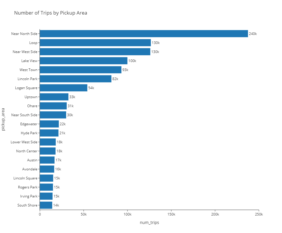
)🎯 Deliverable 20: Number of Trips by Pickup Area (Bar Chart)
👇 Tasks
✔️ Using
df_by_pickup_area, create a horizontal bar chart displaying the number of trips for each pickup area.✔️ Set an appropriate title.
✔️ Set the height to
800and do not supply a width (by default, a Plotly figure will expand to fit the window if thewidthparameter is omitted).✔️ Use the
simple_white(template).✔️ Store your figure in a variable named
fig.✔️ Display the figure using
fig.show()
🔑 Sample Output
🚀 Hint
Replace my_dataframe, 'column1', 'column2', and ...s with your own values from the code below.
fig = px.bar(
my_dataframe,
title='Your Title Here',
x='column1',
y='column2',
text='column1',
template='simple_white',
height=...
)
fig.update_traces(texttemplate='%{text:.2s}', textposition='outside')
fig.update_yaxes(categoryorder='total ascending')
fig.show()# YOUR CODE BEGINS
# YOUR CODE ENDS🧭 Check Your Work
Run the code cell below to test your solution.
✔️ If the code cell runs without errors, you’re good to move on.
❌ If the code cell produces an error, review your code and fix any mistakes.
_test_case = "deliverable-20"
_points = 3
tc.assertIsNotNone(fig.layout.title.text, "Missing figure title")
tc.assertEqual(fig.layout.height, 800, "Incorrect height")
tc.assertEqual(
fig.layout.template,
pio.templates["simple_white"],
"Incorrect plotly theme (template)",
)
decoded_code = base64.b64decode(
b"ZmlnX2NoZWNrID0gcHguYmFyKAog\
ICAgZGZfYnlfcGlja3VwX2FyZWFfY2hlY2ssCiAgICB0aXRsZT0nTnVtYmVyIG\
9mIFRyaXBzIGJ5IFBpY2t1cCBBcmVhJywKICAgIHg9J251bV90cmlwcycsCiAg\
ICB5PSdwaWNrdXBfYXJlYScsCiAgICBjb2xvcj0nbnVtX3RyaXBzJywKICAgIG\
NvbG9yX2NvbnRpbnVvdXNfc2NhbGU9J2VtcmxkJywKICAgIHRleHQ9J251bV90\
cmlwcycsCiAgICB0ZW1wbGF0ZT0ncGxvdGx5X3doaXRlJywKICAgIGhlaWdodD04MDAKKQ=="
)
eval(compile(decoded_code, "<string>", "exec"))
tc.assertEqual(fig.data[0].type, "bar", "Must be a line plot")
np.testing.assert_array_equal(
fig.data[0].x, fig_check.data[0].x, "x-axis value(s) mismatch"
)
np.testing.assert_array_equal(
fig.data[0].y, fig_check.data[0].y, "y-axis value(s) mismatch"
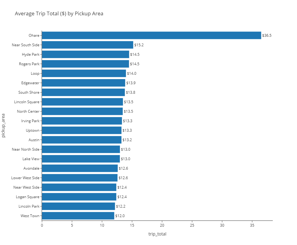
)🎯 Deliverable 21: Average Trip Total by Pickup Area (Bar Chart)
👇 Tasks
✔️ Using
df_by_pickup_area, create a horizontal bar chart displaying the average trip total by each pickup area.✔️ Set an appropriate title.
✔️ Set the height to
800and do not supply a width (by default, a Plotly figure will expand to fit the window if thewidthparameter is omitted).✔️ Use the
simple_whitetheme (template).✔️ Store your figure in a variable named
fig.✔️ Display the figure using
fig.show()
🔑 Sample Output
🚀 Hint
Replace my_dataframe, 'column1', 'column2', and ...s with your own values from the code below.
fig = px.bar(
my_dataframe,
title='Your Title Here',
x='column1',
y='column2',
text='column1',
template='simple_white',
height=...
)
fig.update_traces(texttemplate='$%{text:.1f}', textposition='outside')
fig.update_yaxes(categoryorder='total ascending')
fig.show()# YOUR CODE BEGINS
# YOUR CODE ENDS🧭 Check Your Work
Run the code cell below to test your solution.
✔️ If the code cell runs without errors, you’re good to move on.
❌ If the code cell produces an error, review your code and fix any mistakes.
_test_case = "deliverable-21"
_points = 3
tc.assertIsNotNone(fig.layout.title.text, "Missing figure title")
tc.assertEqual(fig.layout.height, 800, "Incorrect height")
tc.assertEqual(
fig.layout.template,
pio.templates["simple_white"],
"Incorrect plotly theme (template)",
)
decoded_code = base64.b64decode(
b"ZmlnX2NoZWNrID0gcHguYmFyKAogICAg\
ZGZfYnlfcGlja3VwX2FyZWFfY2hlY2ssCiAgICB0aXRsZT0nQXZlcmFnZSBUcmlwIF\
RvdGFsICgkKSBieSBQaWNrdXAgQXJlYScsCiAgICB4PSd0cmlwX3RvdGFsJywKICAg\
IHk9J3BpY2t1cF9hcmVhJywKICAgIHRleHQ9J3RyaXBfdG90YWwnLAogICAgdGVtcG\
xhdGU9J3Bsb3RseV93aGl0ZScsCiAgICBoZWlnaHQ9ODAwCik="
)
eval(compile(decoded_code, "<string>", "exec"))
tc.assertEqual(
fig.data[0].type,
fig_check.data[0].type,
f"Must be a {fig_check.data[0].type} chart",
)
np.testing.assert_array_equal(
fig.data[0].x, fig_check.data[0].x, "x-axis value(s) mismatch"
)
np.testing.assert_array_equal(
fig.data[0].y, fig_check.data[0].y, "y-axis value(s) mismatch"
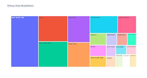
)🎯 Deliverable 22: Pickup Area Breakdown (Treemap)
👇 Tasks
✔️ Using
df_by_pickup_area, create a treemap of pickup areas.✔️ Set an appropriate title.
✔️ Store your figure in a variable named
fig.✔️ Display the figure using
fig.show()
🔑 Sample Output
# YOUR CODE BEGINS

# YOUR CODE ENDS
🧭 Check Your Work
Run the code cell below to test your solution.
✔️ If the code cell runs without errors, you’re good to move on.
❌ If the code cell produces an error, review your code and fix any mistakes.
_test_case = "deliverable-22"
_points = 3
tc.assertIsNotNone(fig.layout.title.text, "Missing figure title")
decoded_code = base64.b64decode(
b"ZmlnX2NoZWNrID0gcHgudHJlZW1hcCg\
KICAgIGRmX2J5X3BpY2t1cF9hcmVhX2NoZWNrLAogICAgdGl0bGU9J1BpY2t1cCBB\
cmVhIEJyZWFrZG93bicsCiAgICBwYXRoPVsncGlja3VwX2FyZWEnXSwKICAgIHZhb\
HVlcz0nbnVtX3RyaXBzJywKICAgIGhlaWdodD02MDAKKQ=="
)
eval(compile(decoded_code, "<string>", "exec"))
tc.assertEqual(fig.data[0].type, "treemap", "Must be a treemap")
np.testing.assert_array_equal(
fig.data[0].labels, fig_check.data[0].labels, "Label value(s) mismatch"
)
np.testing.assert_array_equal(
fig.data[0].parents, fig_check.data[0].parents, "Parent value(s) mismatch"
)
np.testing.assert_array_equal(
fig.data[0].values, fig_check.data[0].values, "Size value(s) mismatch"
)📌 Interpreting the Pickup Area Visualizations
🔍 “Near North Side” is the most popular pickup area, followed by “Loop” and “Near West Side”.
🔍 The average trip total for rides beginning in O’Hare is relatively much higher compared to any other pickup area.
🦄 Part 7: Pickup Area + Weekday/Weekend
In this part, you will add a new dimension (weekday/weekend) to the top 20 pickup areas.
🎯 Deliverable 23: Number of Trips and Average Trip Total by Pickup Area + Weekday/Weekend
👇 Tasks
✔️ Using
df_filtered, calculate the following aggregated values bypickup_areaandweekday_weekend.num_trips: Number of tripstrip_total: Averagetrip_total
✔️ Store the resulting DataFrame in a new variable named
df_by_pickup_area_weekday_weekend.✔️
print(df_by_pickup_area_weekday_weekend.columns.tolist())should print out['pickup_area', 'weekday_weekend', 'num_trips', 'trip_total'].✔️
df_filteredshould remain unaltered.
🔑 Expected Output
| pickup_area | weekday_weekend | num_trips | trip_total | |
|---|---|---|---|---|
| 0 | Austin | weekday | 9064 | 13.2139 |
| 1 | Austin | weekend | 7787 | 13.284 |
| 2 | Avondale | weekday | 7942 | 12.6175 |
| 3 | Avondale | weekend | 8483 | 12.6297 |
| 4 | Edgewater | weekday | 10745 | 14.1318 |
| 5 | Edgewater | weekend | 10944 | 13.608 |
| 6 | Hyde Park | weekday | 11852 | 14.1627 |
| 7 | Hyde Park | weekend | 9451 | 14.977 |
| 8 | Irving Park | weekday | 7307 | 13.4092 |
| 9 | Irving Park | weekend | 7263 | 13.2436 |
# YOUR CODE BEGINS

# YOUR CODE ENDS
display(df_by_pickup_area_weekday_weekend.head(10))🧭 Check Your Work
Run the code cell below to test your solution.
✔️ If the code cell runs without errors, you’re good to move on.
❌ If the code cell produces an error, review your code and fix any mistakes.
_test_case = "deliverable-23"
_points = 6
decoded_code = base64.b64decode(
b"CmRmX2J5X3BpY2t1cF9hcmVhX3dlZWtkYXlfd2Vla2VuZF9jaGVj\
ayA9IGRmX2ZpbHRlcmVkX2NoZWNrLmdyb3VwYnkoCiAgICBbJ3BpY2t1cF9hcmVhJywgJ3dlZWtkYXlfd2Vla2\
VuZCddLCBhc19pbmRleD1GYWxzZQopLmFnZyh7CiAgICAnc3RhcnQnOiAnY291bnQnLAogICAgJ3RyaXBfdG90\
YWwnOiAnbWVhbicsCn0pLnJlbmFtZShjb2x1bW5zPXsKICAgICdzdGFydCc6ICdudW1fdHJpcHMnCn0pCg=="
)
eval(compile(decoded_code, "<string>", "exec"))
tc.assertEqual(
df_by_pickup_area_weekday_weekend.columns.tolist(),
df_by_pickup_area_weekday_weekend_check.columns.tolist(),
"Column(s) mismatch",
)
tc.assertEqual(
df_by_pickup_area_weekday_weekend.shape,
df_by_pickup_area_weekday_weekend_check.shape,
"Incorrect number of rows and/or columns",
)
pd.testing.assert_frame_equal(
df_by_pickup_area_weekday_weekend.sort_values(
df_by_pickup_area.columns.tolist()
).reset_index(drop=True),
df_by_pickup_area_weekday_weekend_check.sort_values(
df_by_pickup_area_check.columns.tolist()
).reset_index(drop=True),
check_like=True,
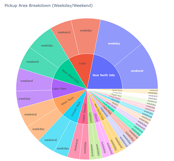
)🎯 Deliverable 24: Pickup Area + Weekday/Weekend Breakdown (Sunburst)
👇 Tasks
✔️ Using
df_by_pickup_area_weekday_weekend, create a sunburst chart describing the breakdown of number of trips by pickup area and weekday/weekend classification.✔️ Set an appropriate title.
✔️ Set both the width and height to
800.✔️ Store your figure in a variable named
fig.✔️ Display the figure using
fig.show()
🔑 Sample Output
# YOUR CODE BEGINS

# YOUR CODE ENDS
🧭 Check Your Work
Run the code cell below to test your solution.
✔️ If the code cell runs without errors, you’re good to move on.
❌ If the code cell produces an error, review your code and fix any mistakes.
_test_case = "deliverable-24"
_points = 4
tc.assertIsNotNone(fig.layout.title.text, "Missing figure title")
tc.assertEqual(fig.data[0].type, "sunburst", "Must be a sunburst chart")
tc.assertEqual(fig.layout.width, 800, "Incorrect width")
tc.assertEqual(fig.layout.height, 800, "Incorrect height")
decoded_code = base64.b64decode(
b"ZmlnX2NoZWNrID0gcHguc3VuYnVyc3\
QoCiAgICBkZl9ieV9waWNrdXBfYXJlYV93ZWVrZGF5X3dlZWtlbmQsCiAgICBwYX\
RoPVsncGlja3VwX2FyZWEnLCAnd2Vla2RheV93ZWVrZW5kJ10sCiAgICB2YWx1ZX\
M9J251bV90cmlwcycsCiAgICB0aXRsZT0nUGlja3VwIEFyZWEgQnJlYWtkb3duIC\
hXZWVrZGF5L1dlZWtlbmQpJywKICAgIHdpZHRoPTgwMCwKICAgIGhlaWdodD04MDAKKQ=="
)
eval(compile(decoded_code, "<string>", "exec"))
np.testing.assert_array_equal(
fig.data[0].labels, fig_check.data[0].labels, "Label(s) mismatch"
)
np.testing.assert_array_equal(
fig.data[0].parents, fig_check.data[0].parents, "Parent(s) mismatch"
)
np.testing.assert_array_equal(
fig.data[0].values, fig_check.data[0].values, "Value(s) mismatch"
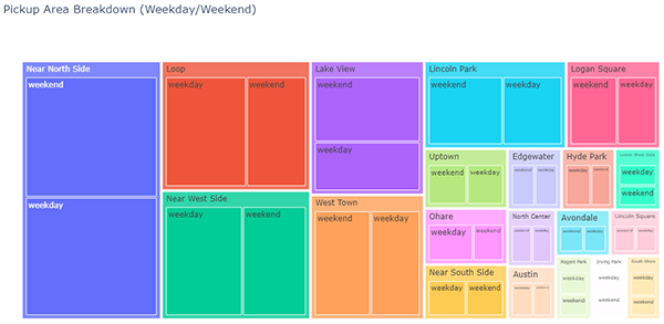
)🎯 Deliverable 25: Pickup Area + Weekday/Weekend Breakdown (Treemap)
👇 Tasks
✔️ Using
df_by_pickup_area_weekday_weekend, create a treemap chart describing the breakdown of number of trips by pickup area and weekday/weekend classification.✔️ Set an appropriate title.
✔️ Set the height to
600(do not set the width).✔️ Store your figure in a variable named
fig.✔️ Display the figure using
fig.show()
🔑 Sample Output
# YOUR CODE BEGINS

# YOUR CODE ENDS
🧭 Check Your Work
Run the code cell below to test your solution.
✔️ If the code cell runs without errors, you’re good to move on.
❌ If the code cell produces an error, review your code and fix any mistakes.
_test_case = "deliverable-25"
_points = 4

tc.assertIsNotNone(fig.layout.title.text, "Missing figure title")
tc.assertEqual(fig.data[0].type, "treemap", "Must be a treemap chart")
tc.assertEqual(fig.layout.height, 600, "Incorrect height")

decoded_code = base64.b64decode(
    b"ZmlnID0gcHgudHJlZW1hcCgKICAgIGRm\
X2J5X3BpY2t1cF9hcmVhX3dlZWtkYXlfd2Vla2VuZCwKICAgIHBhdGg9WydwaWNrdX\
BfYXJlYScsICd3ZWVrZGF5X3dlZWtlbmQnXSwKICAgIHZhbHVlcz0nbnVtX3RyaXBz\
JywKICAgIHRpdGxlPSdQaWNrdXAgQXJlYSBCcmVha2Rvd24gKFdlZWtkYXkvV2Vla2\
VuZCknLAogICAgaGVpZ2h0PTYwMAop"
)
eval(compile(decoded_code, "<string>", "exec"))

np.testing.assert_array_equal(
    fig.data[0].labels, fig_check.data[0].labels, "Label(s) mismatch"
)

np.testing.assert_array_equal(
    fig.data[0].parents, fig_check.data[0].parents, "Parent(s) mismatch"
)

np.testing.assert_array_equal(
    fig.data[0].values, fig_check.data[0].values, "Value(s) mismatch"
)