Welcome to the final and the coolest part of this course! 😎 I’m not saying that the previous topics aren’t cool. But visualizations are the bridges that can connect your data analytics skills with the outside world. The last thing you want to do is print out a large DataFrame to report your findings.
Data visualization translates raw data into visual stories that reveal patterns, trends, and relationships. Humans process visual information far faster than text or tables—so effective visualizations help analysts think, communicate, and persuade.
There is no such thing as information overload. There is only bad design.
Edward Tufte
✨ From Data to Visualization: A Workflow
Define the Question: What decision or hypothesis are you exploring?
Acquire and Clean Data: Remove noise, handle missing values.
Choose the Visual Form: Match data type (categorical, continuous, time-series) to appropriate chart.
Design and Annotate: Add titles, captions, and labels.
Iterate: Test different layouts and get user feedback.
📊 Types of Data Visualization
🧭 Exploratory vs. Explanatory
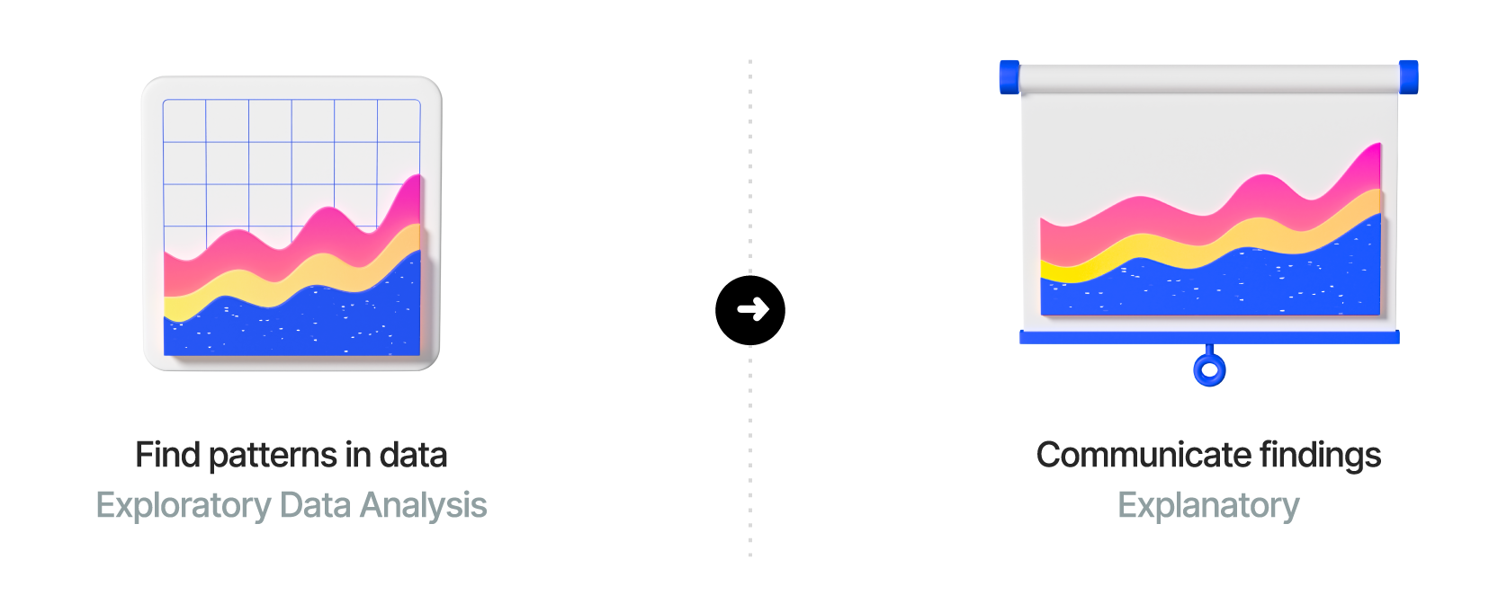
Exploratory visualizations are used during the data analysis phase to discover patterns and insights. They are often more complex and may include multiple variables. We have covered the common techniques for EDA (Exploratory Data Analysis) in previous sections. Think of exploratory visualizations as another tool in your data analysis toolbox that helps you understand the data better.
Explanatory visualizations, on the other hand, are designed to communicate a specific message or finding to an audience. They are typically simpler and more focused.
🧩 Patterns in Data Visualization
When we visualize data, we are not simply drawing charts - we are searching for patterns. Most quantitative insights can be grouped into five broad categories of data patterns. Recognizing these patterns helps analysts choose the most effective visual representation for their message.
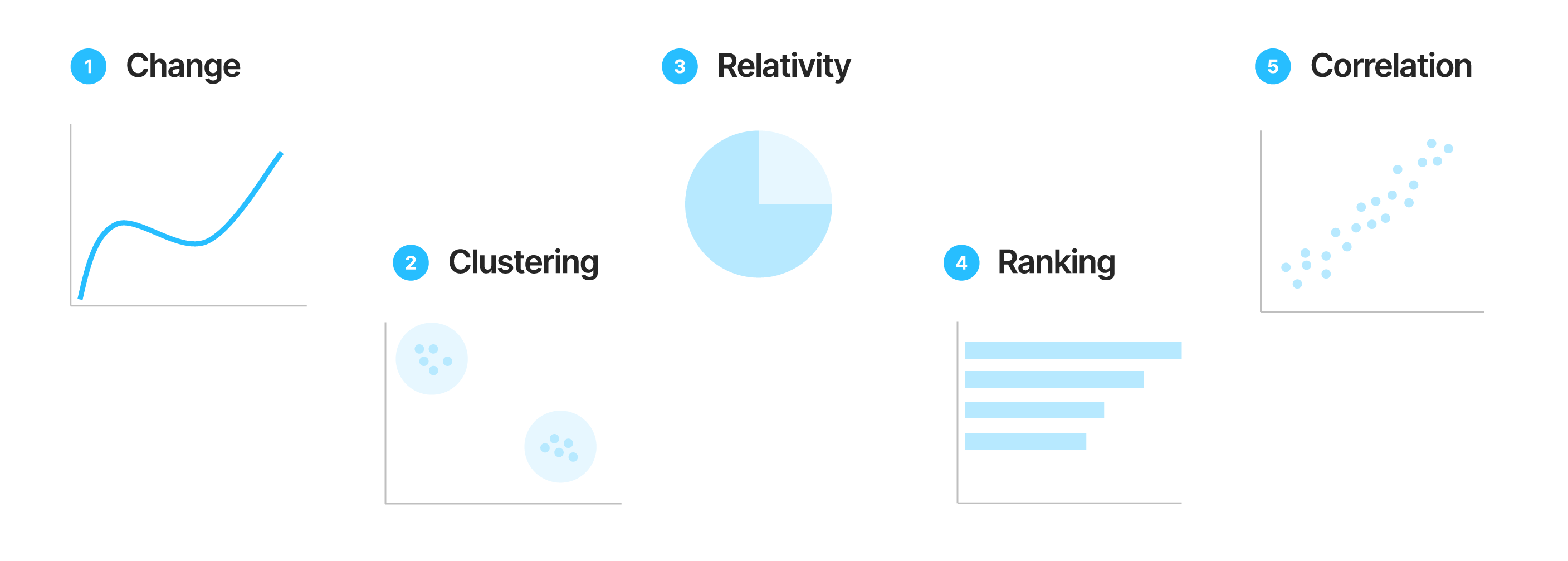
1️⃣ Change
Definition: Shows how a variable evolves over time.
Examples: Line charts, area charts, or bar charts that track trends.
Use When: You want to highlight growth, decline, or seasonal fluctuations.
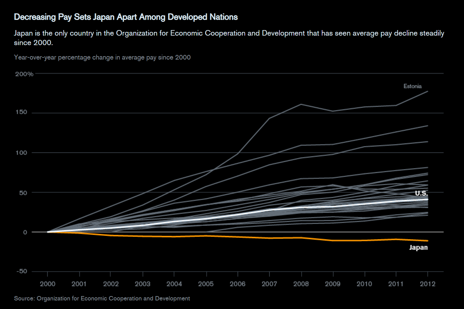
Figure 1:Japan Average Pay Decline (Source: Bloomberg)
2️⃣ Clustering
Definition: Reveals natural groupings or segments within data.
Examples: Scatter plots or bubble charts showing customer segments, product groups, or behavioral clusters.
Use When: You want to explore differences and similarities between observations.
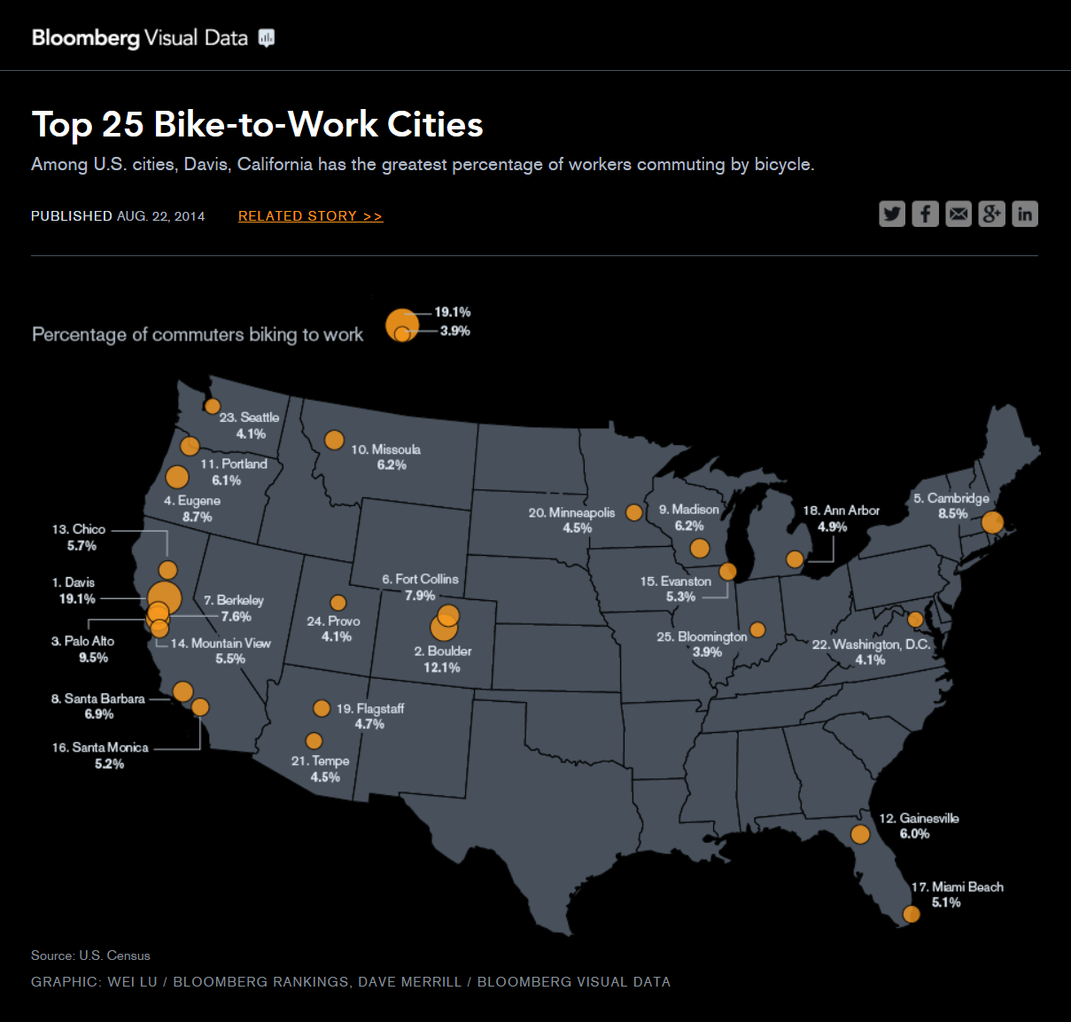
Figure 2:Top 25 Bike to Work Cities (Source: Bloomberg)
3️⃣ Relativity
Definition: Displays how parts relate to a whole.
Examples: Pie charts, donut charts, or stacked bar charts.
Use When: You want to emphasize proportions or contribution to a total.
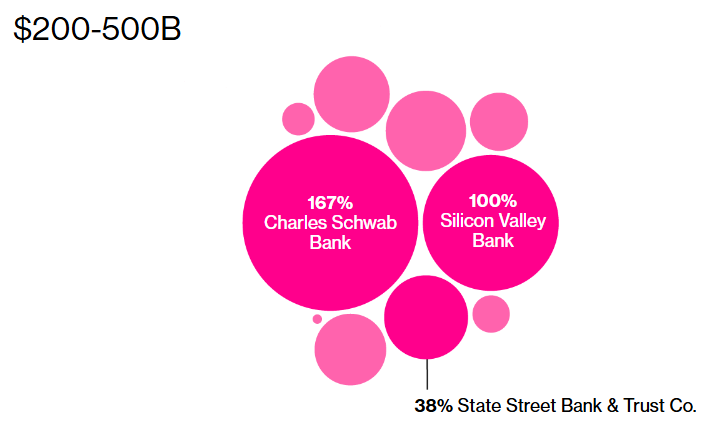
Figure 3:US Bank 2023 Unrealized Losses (Source: Bloomberg)
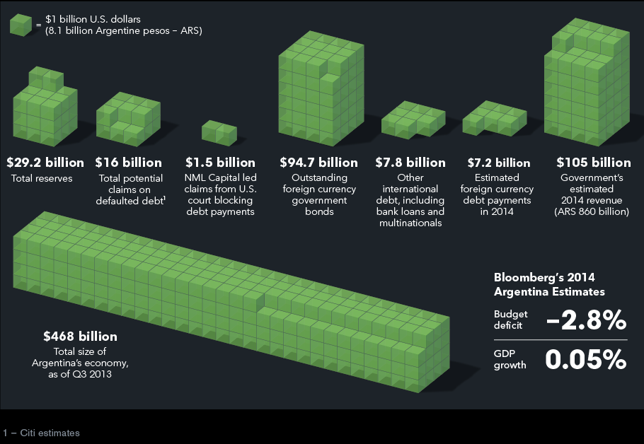
Figure 4:Argentina Budget Estimates 2014 (Source: Bloomberg)
4️⃣ Ranking
Definition: Compares ordered categories to identify leaders or laggards.
Examples: Horizontal bar charts, lollipop charts, or sorted column charts.
Use When: You want to show the top or bottom performers (e.g., top 10 sales regions).
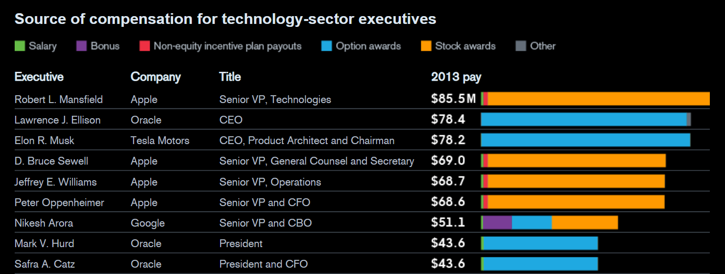
Figure 5:2014 Tech Executive Pay Packages (Source: Bloomberg)
5️⃣ Correlation
Definition: Illustrates relationships between two or more quantitative variables.
Examples: Scatter plots, correlation matrices, or regression lines.
Use When: You want to determine whether changes in one variable are associated with changes in another.
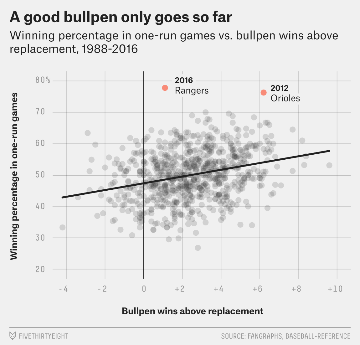
Figure 6:Good Bullpen Only Goes So Far (Source: FiveThirtyEight)
🧪 Why It Matters
Identifying these five data patterns helps analysts choose the right visualization for their story. Rather than focusing on chart types first, start by asking:
“What kind of pattern am I trying to show - change, clustering, relativity, ranking, or correlation?”
🗂️ Common Chart Types
| Chart Type | Best For | Avoid When |
|---|---|---|
| Bar Chart | Comparing categorical values | Too many categories |
| Line Chart | Showing trends over time | Non-sequential categories |
| Scatter Plot | Revealing relationships between two variables | Too few data points |
| Histogram | Showing data distribution | Comparing multiple groups |
| Box Plot | Summarizing distribution & outliers | Small samples |
| Pie / Donut Chart | Showing parts of a whole | Many small slices |
| Heatmap | Displaying matrix or correlation patterns | Hard-to-read color scales |
| TreeMap / Sunburst | Hierarchical proportions | Need precise comparisons |
🧾 Common Pitfalls in Data Visualization
| Pitfall | Description | Better Practice |
|---|---|---|
| Overuse of 3D | Distorts proportions | Stick to 2D |
| Too Many Colors | Confuses audience | Use ≤ 5 meaningful colors |
| Truncated Y-Axis | Misleads differences | Start at 0 for bar charts |
| Dense Dashboards | Cognitive overload | Prioritize key visuals |
| Unlabeled Axes | Ambiguous meaning | Always label variables |
📚 Dataviz libraries
The mostly commonly used library for data visualization in introductory data analytics courses is matplotlib, a low-level visualization library for Python. seaborn is another popular library built on top of matplotlib that provides a higher-level interface for creating attractive and informative statistical graphics.
Below are some of the most popular and battle-tested data visualization libraries - all of which are free and open source:
matplotlib: Low-level visualization library for Python
seaborn: High-level visualization library for Python built on matplotlib
bokeh: Interactive visualizations for modern web browsers
plotly: Interactive visualization library supporting Python, JavaScript, and R
altair: Declarative visualization library for Python based on Vega
🎨 Plot.ly
We’ll use plotly, which provides both low-level and high-level interfaces to create publication-ready graphs.
To use plotly in JupyterLab, install the jupyterlab and anywidget packages in the same environment as you installed plotly, using pip inside a terminal:
pip install plotly anywidgetor conda:
conda install plotly anywidgetYou can use the exclamation mark ! to run shell commands directly from a Jupyter notebook cell:
!pip install plotly anywidgetor
!conda install plotly anywidgetIt’s generally a better practice to run installation commands in a terminal rather than inside a Jupyter notebook to avoid environment issues.
🛠️ Exercises using an HR Dataset
▶️ Import the following Python packages.
pandas: Use aliaspd.numpy: Use aliasnp.plotly.express: Use aliaspx.plotly.graph_objects: Use aliasgo.
import pandas as pd
import numpy as np

import plotly.graph_objects as go
import plotly.express as px
▶️ Check the version of plotly installed in your environment.
import plotly

print(f"Plotly version: {plotly.__version__}")
Plotly version: 6.3.1
Today, we work with an HR Dataset to uncover insights about HR metrics, measurement, and analytics. The data has been downloaded from https://
▶️ Import the HR Dataset. 🐷👧👨🏻🦰👩🏼🦳👳🏽♂️👩🏾🦲🐼.
# Display all columns
pd.set_option("display.max_columns", 50)

df_hr = pd.read_csv("https://github.com/bdi475/datasets/raw/main/HR-dataset-v14.csv")

display(df_hr)📦 Box Plot
Box plots divide the data into 4 sections that each contain 25% of the data. It is useful to quickly identify the distribution of the data based on Q1, Q2 (median), and Q3.
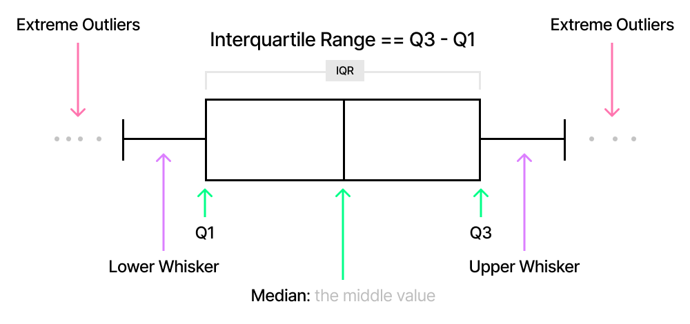
▶️ Create a simple box plot of 12 different GPAs. NumPy is used here to calculate the statistical figures.
gpa = np.array(
    [3.33, 2.67, 3.0, 3.67, 3.67, 2.33, 3.0, 3.0, 2.67, 4.0, 3.33, 2.67, 4.0]
)
gpa
array([3.33, 2.67, 3. , 3.67, 3.67, 2.33, 3. , 3. , 2.67, 4. , 3.33,
2.67, 4. ])fig = px.box(x=gpa, title="GPA Distribution (Horizontal Box Plot)")
fig.show()print(f"Mean: {np.mean(gpa)}")
print(f"Median: {np.median(gpa)}")
print(f"Q1: {np.quantile(gpa, 0.25)}")
print(f"Q3: {np.quantile(gpa, 0.75)}")
print(f"IQR: {np.quantile(gpa, 0.75) - np.quantile(gpa, 0.25)}")Mean: 3.18
Median: 3.0
Q1: 2.67
Q3: 3.67
IQR: 1.0
🗺️ Findings
Median is
3.Minimum is
2.33.Maximum is
4.Interquartile range is
1.You can calculate this value by subtracting Q1 from Q3:
3.67 - 2.67.
There is a positive skew.
This is also shown by comparing the mean and the median.
fig = px.box(df_hr, y="Salary", title="Salary Distribution (Vertical)")
fig.show()fig = px.box(df_hr, x="Salary", title="Salary Distribution (Horizontal)")
fig.show()🎯 Example 3: Salary distribution by citizenship status
▶️ Draw horizontal box plots of Salary by CitizenDesc.
fig = px.box(
    df_hr,
    x="Salary",
    y="CitizenDesc",
    title="Salary Distribution by Citizenship Status",
)
fig.show()🎯 Example 4: Salary distribution by performance
▶️ Draw horizontal box plots of Salary by PerformanceScore.
# YOUR CODE BEGINS
fig = px.box(
    df_hr,
    x="Salary",
    y="PerformanceScore",
    title="Salary Distribution by Performance Score",
)
fig.show()
# YOUR CODE ENDS🎯 Example 5: Salary distribution by department
▶️ Draw horizontal box plots of Salary by Department.
# YOUR CODE BEGINS
fig = px.box(
    df_hr,
    x="Salary",
    y="Department",
    title="Salary Distribution by Department",
    height=600,
)
fig.show()
# YOUR CODE ENDS🧮 Histogram
Histograms display frequency distributions using bars of different heights.
Here is an example histogram showing the distribution of 500 random integers following a normal distribution.
fig = px.histogram(x=np.random.randn(500))
fig.show()fig = px.histogram(df_hr, x="Salary", title="Salary Distribution")
fig.show()fig = px.histogram(df_hr, x="Absences", title="Number of Absence Distribution")
fig.show()🎯 Example 8: Salary histograms by gender
▶️ Draw overlaid histograms of Salary in df_hr by GenderID.
fig = go.Figure()
fig.add_trace(go.Histogram(x=df_hr[df_hr["GenderID"] == 0]["Salary"], name="Male"))

fig.add_trace(go.Histogram(x=df_hr[df_hr["GenderID"] == 1]["Salary"], name="Female"))

# Overlay both histograms
fig.update_layout(barmode="overlay")

# Reduce opacity to see both histograms
fig.update_traces(opacity=0.6)
fig.show()